About Our Luxury Towel Collection
With sun-bleached colors and weathered textures, the look of handmade textiles lend themselves to soft, versatile essentials for any season. Our collection of Luxury Towels embody the desire to escape to pristine waters or to the lushness of the outdoors. Thoughtfully subtle color palettes are applied in playful and precise combinations to fully capture the hues that surround us abroad and in nature.
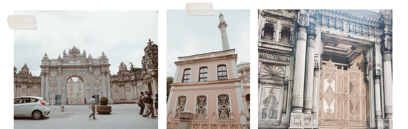
Our Gilded Arrow journey began in Istanbul, where we were inspired by the extravagant, gold embellished palaces and mosques.
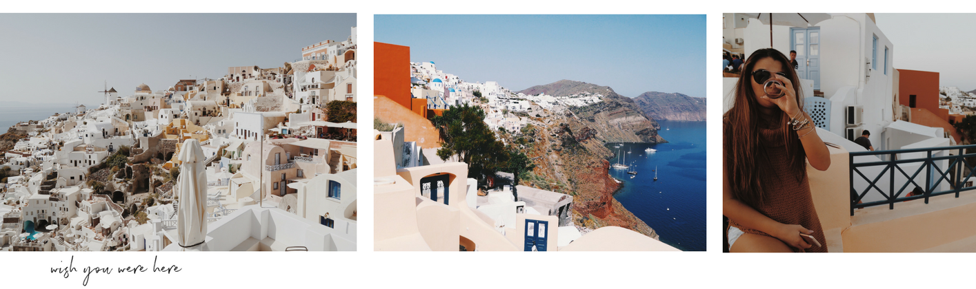
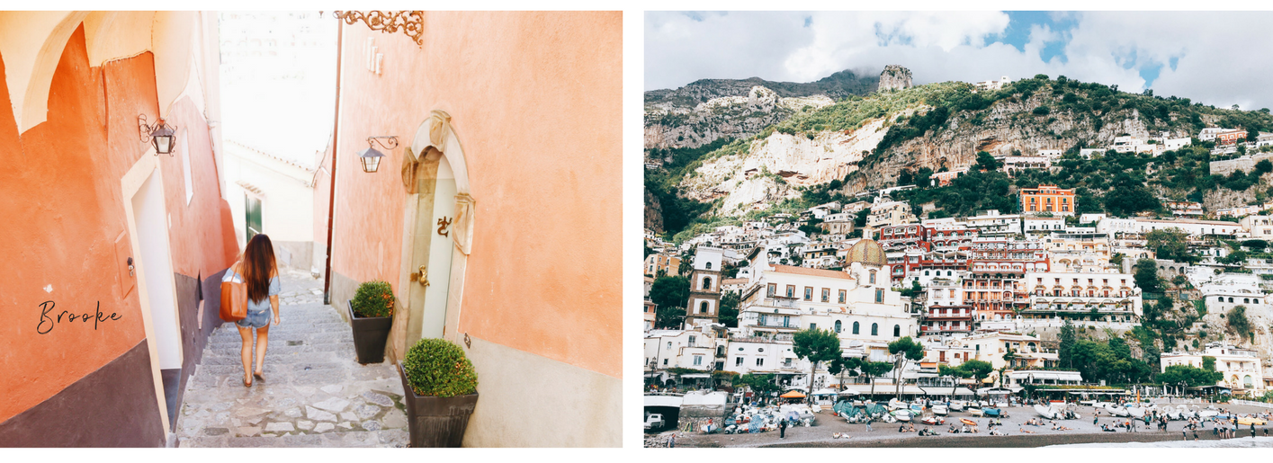
We were captivated by the neutral aesthetic of Santorini’s Cliffside, painted with white and pastel colored homes layered on top of each other.
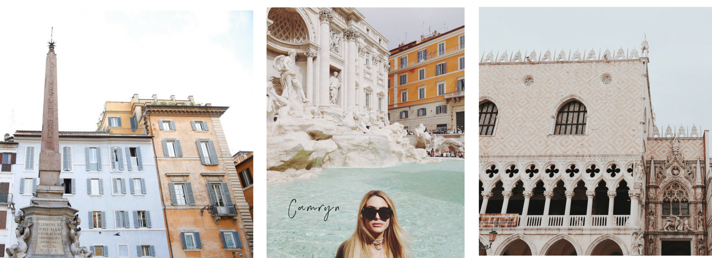
Rome’s Trevi Fountain contrasted with the surrounding peach tone and terracotta buildings which also influenced this collection’s color palette; as well as Venice, which boasts soothing gothic architecture accompanied by blush patchwork and mosaic tiles creating contrasting eye candy.
Finally, the Moroccan inspired beach-towns of Positano and Capri seduce with the creamy pink + white villages etched into the steep cliffs, covered in greenery.

Enkindled by the natural side of neutral color palettes we observed, this collection’s muted hues were designed to elevate your everyday and to complement the things you already have and wear every day.
Color Palette: Origins
While traveling, we let ourselves dive into new cultures and always observe how color tones influences each place we visit.
-
Champagne
This collection’s base shade for our luxury towels is a barely there ivory. Like a scoop of champagne gelato in Rome with fresh cream on top, this romantic and ethereal base shade radiates simplicity and sets the canvas for our color palette to shine.
-
Turmeric
Along with its origins as a powerful, flowering plant, the color of Turmeric powder is reminiscent of the sun on our skin. A warming shade that brings good feelings of a spontaneous summer, it speaks to authenticity and all that is natural.
-
Terracotta
Earthy and strong, Terracotta provides us with a return to nature and to what is beautiful, simple, and memorable. Energizing and striking enough to stand on its own, this color adds vitality to any look with its warm, peachy-edge.
-
Moss
This color is bold, rich, and associated with deep-rooted, elegant earth tones. As nature’s neutral, moss is reminiscent of luxurious botanicals, the hue of lush foliage, or a flourishing palm frond. Illustrating the lushness of the great outdoors, the fortifying attributes of Moss signal us to take a deep breath and unplug.
-
Earth
A deep shade of black, similar to the gemstones and minerals produced naturally by Earth. Much like jet, obsidian, or onyx, this shade feels sophisticated as it absorbs negative energy and creates contrast.
-
Stone
Grounding and soothing, Stone is another neutral of choice, this warm taupe equalizes any brighter color around it. A shade that feels organic, yet elevated and timeless as it is the foundation of classic architecture around the world.
-
Moon
Like the tides it influences, the color Moon is able to revive, restore and renew while giving off a planetary glow. This color is a dreamy blue-grey hue, harmonic, serene, and reminiscent of the sky above.
-
Bellini
First served in Venice in the late 1930s, but sipped often by us in Positano, this color is reminiscent of the pastel-colored concoction made by mixing a bit of peach puree with champagne. This muted pink hue gives us a nostalgic feel, similar to a cotton candy sunset, flushing cheeks, or a budding flower.